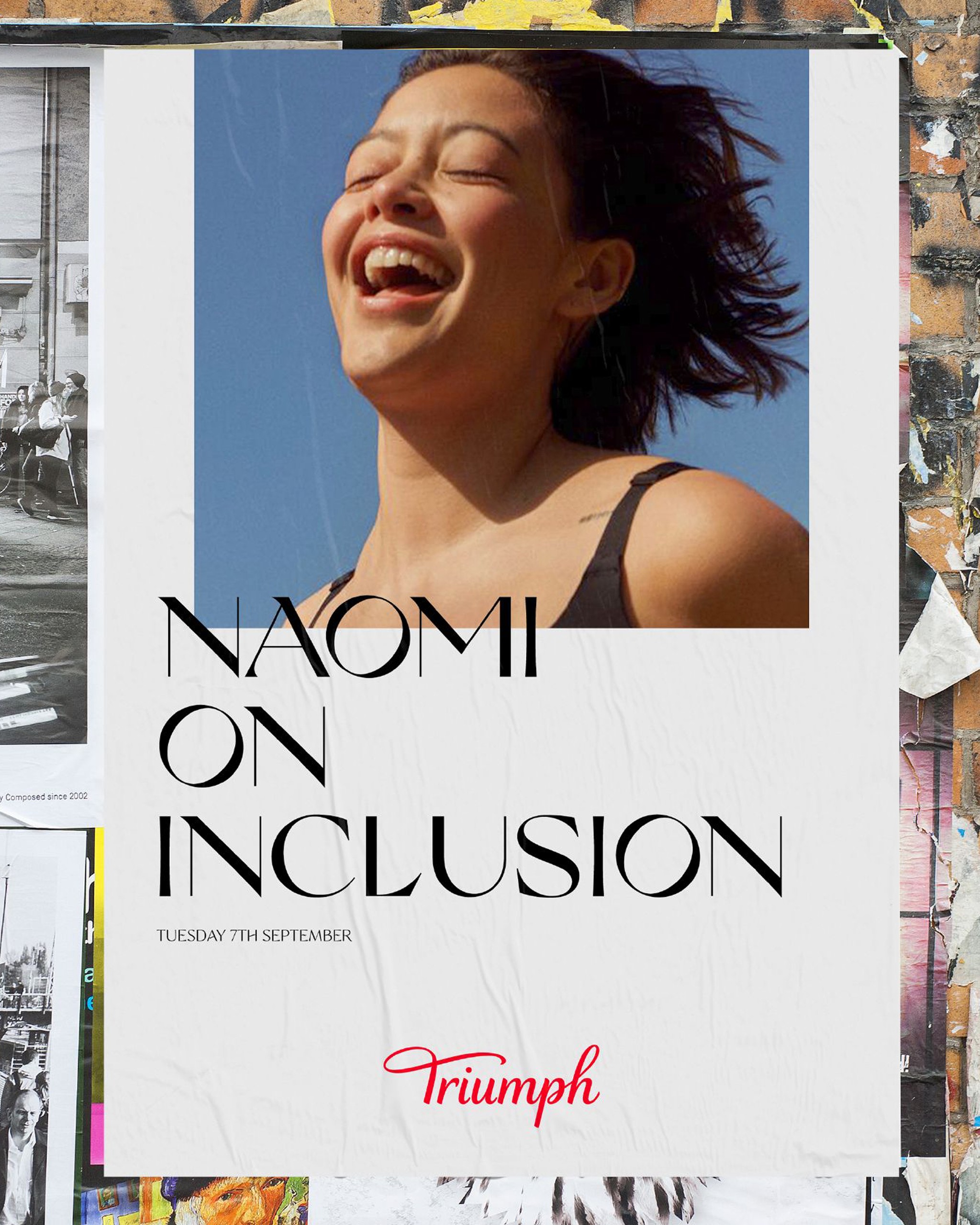
Triumph Experience:
Designed for you, online and in store.
Editorial modernity with gravitas.
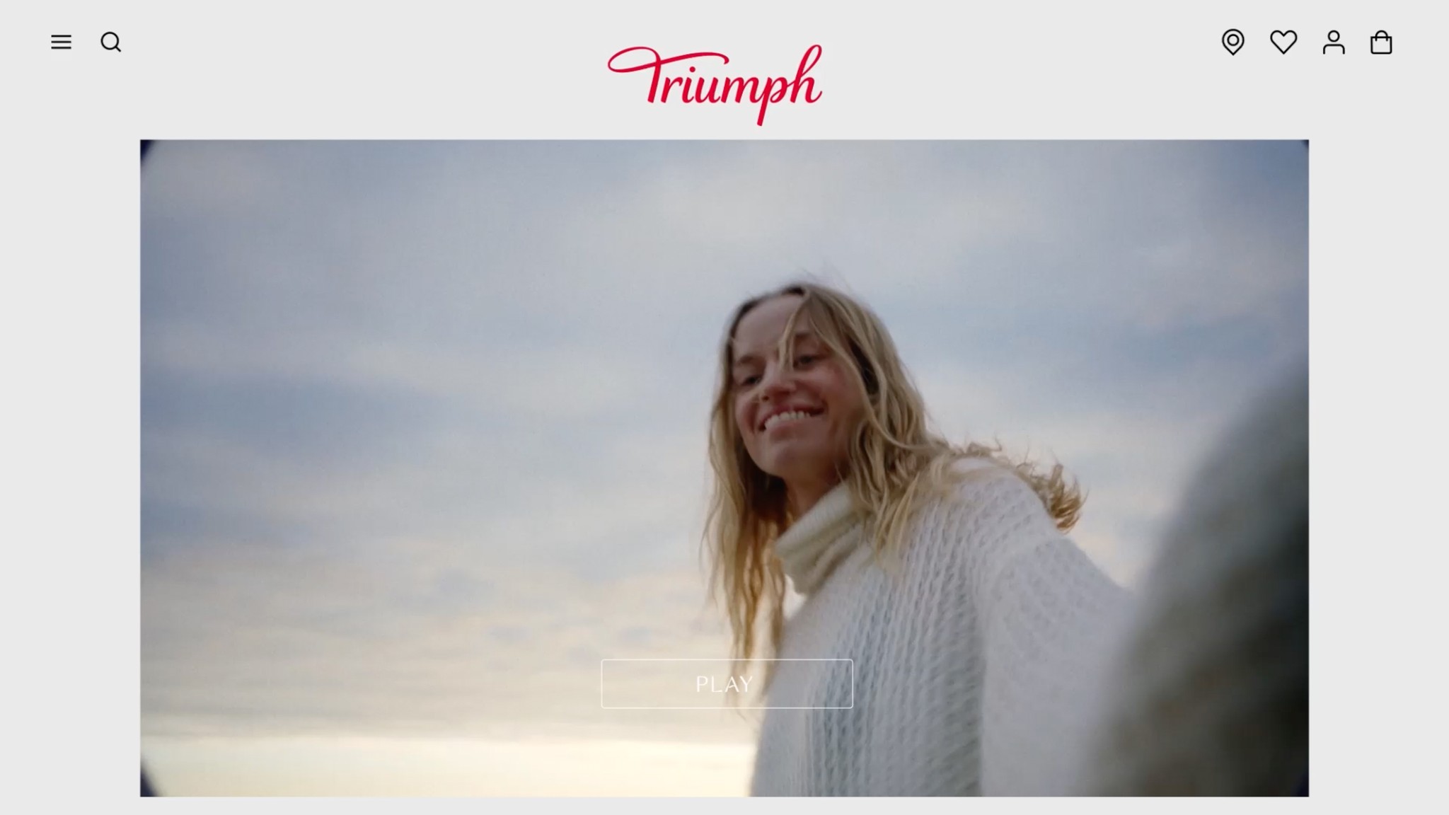
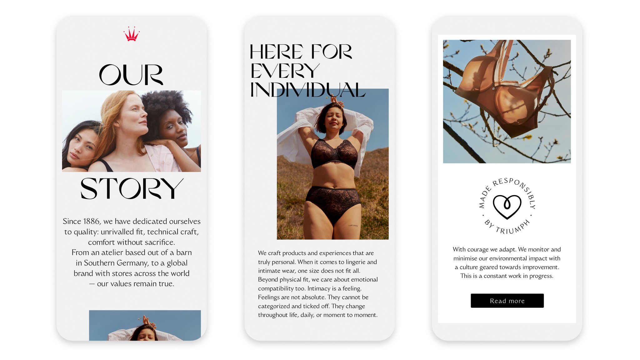
We redesigned Triumph’s global website as part of a large-scale identity refresh. Our main mission was to elevate the brand’s look and feel. We hero our bespoke typeface, Triumph Grand, created with Nikolas Type.
It was important the website translates our core brand strategy: we want every Triumph consumer to feel recognized and celebrated as an individual. Key parts of the user experience reflect this. Consumers can choose between a product view or model view, as well as select the model that works best for them. We also drive cross-channel engagement by highlighting Triumph’s expertise in fit — book a fitting appointment online, and dive deeper into each store’s unique features. Triumph has a presence on nearly every continent. We believe its digital footprint should present a distinct yet unified front.
Carving a space for craft and comfort.
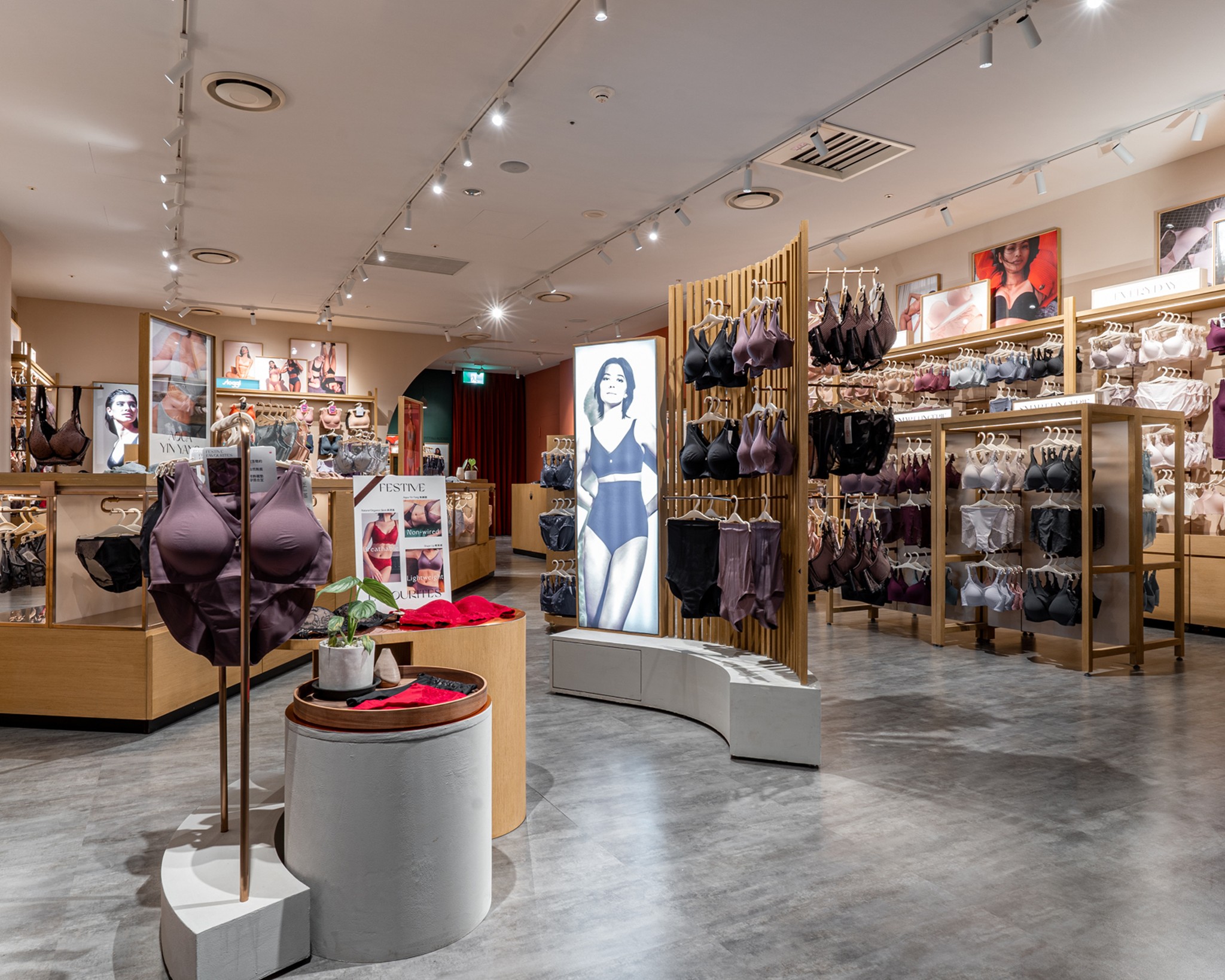
Our concept partly took inspiration from Triumph’s atelier roots, and partly from a strategy to reinforce the importance of intimacy. We wanted every touchpoint to feel personal, comfortable, and treasured. The main inspiration reframed the artists’ workshop: emphasizing tactile materiality and quality craftsmanship. As consumers enter and explore, they should feel immersed in a moment for themselves: calmed, at peace, and in touch.

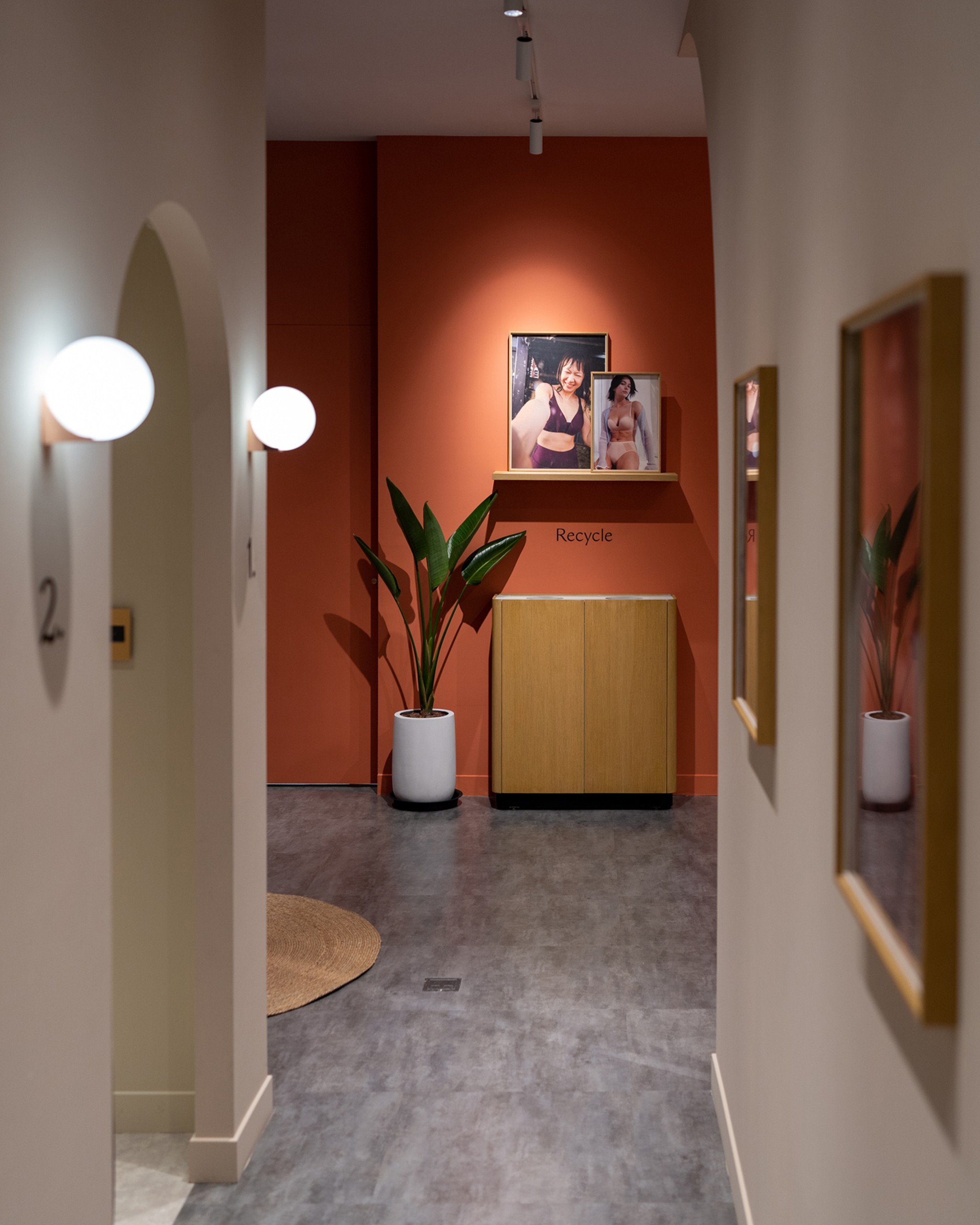
Redefining personal space.
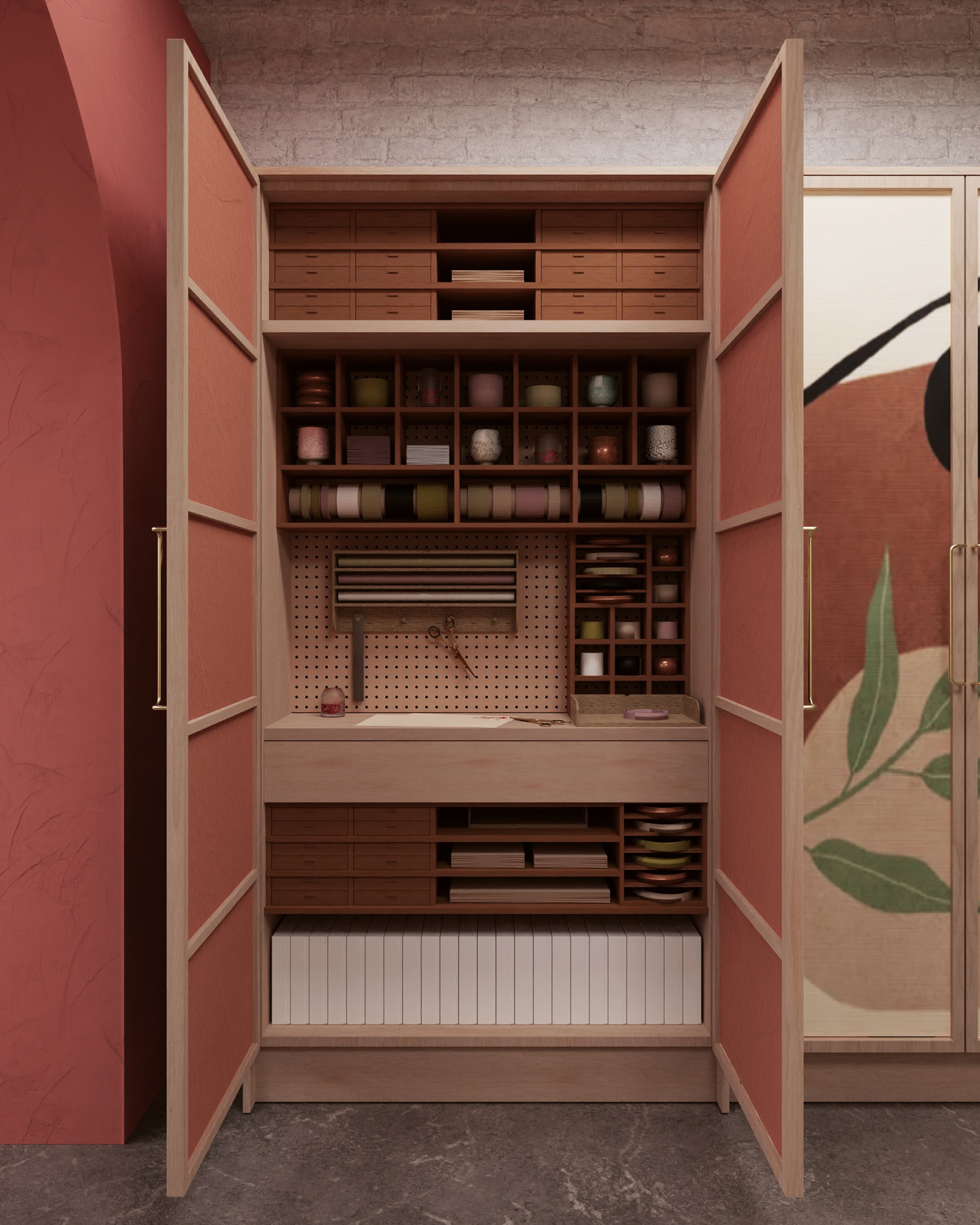
We emphasize Triumph’s dedication to service through key experiential moments. Carving out a premium fitting area, and developing dedicated spaces where staff can prepare drinks, gift wrap, and enhance the feeling of “made-to-measure.”
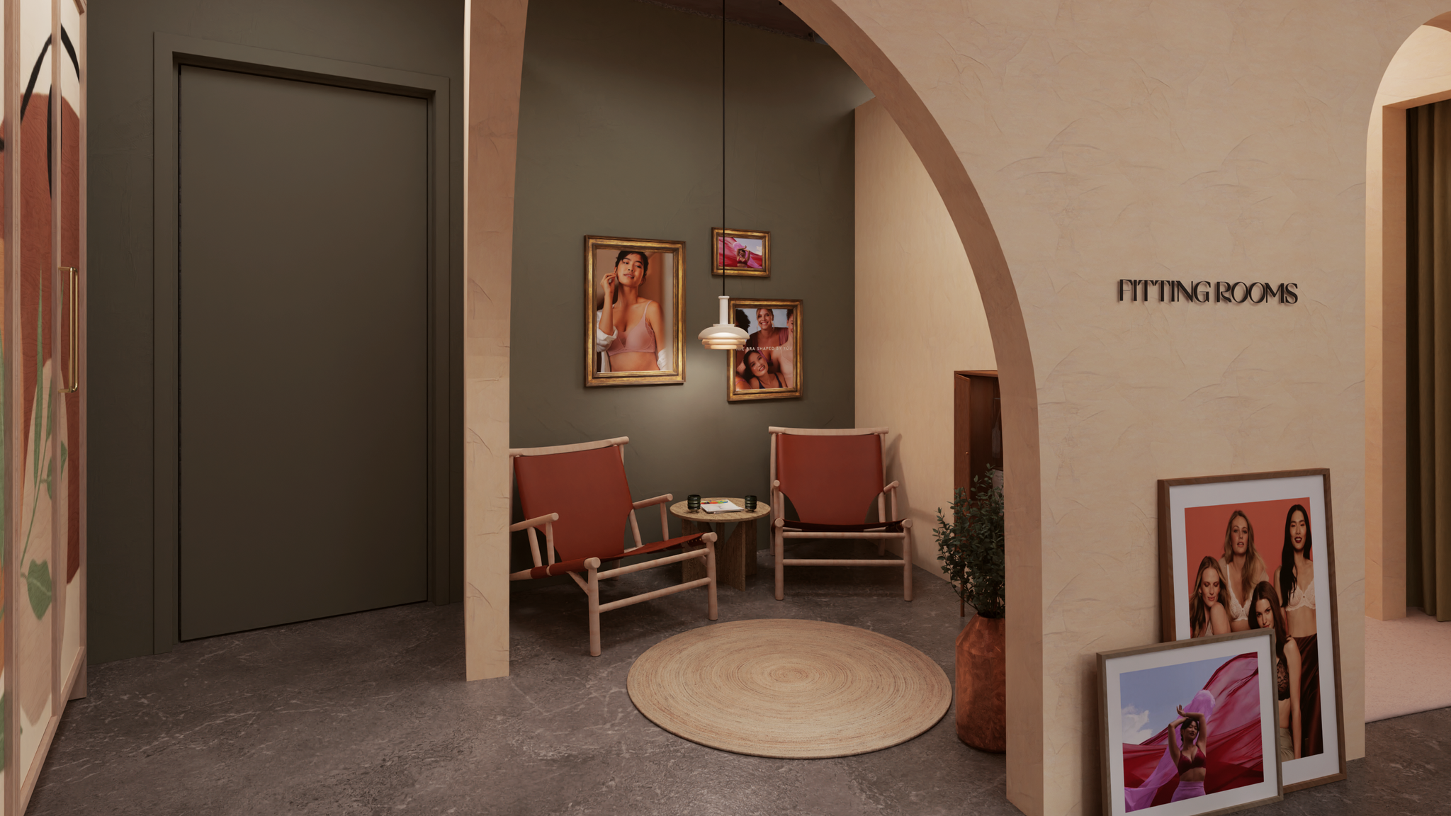

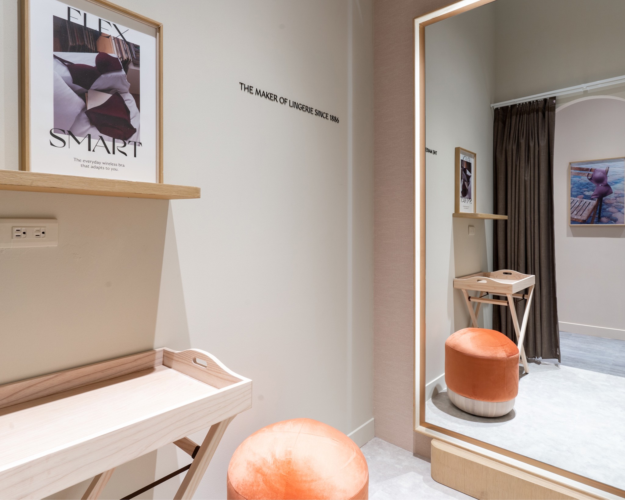
The Fitting Ceremony.
Triumph is the industry expert in fit. We redesigned the fitting room to pay homage to this title. Creating spaces that prioritise attention to detail, that allow each customer to experience a personalised fitting ceremony.

Notes from Karl, our Interior Designer.
The initial inspiration for our conceptual approach was to capture the openness and intimacy that creative spaces provide. Through open and informative discussions, we could hone the central idea whilst working hand in hand with the wider branding and digital work. Nurturing this cooperative process worked not only on the creative level, but informed client workshops. This meant delivering on conceptual thinking and achieving the perfect balance between utility and creativity.

