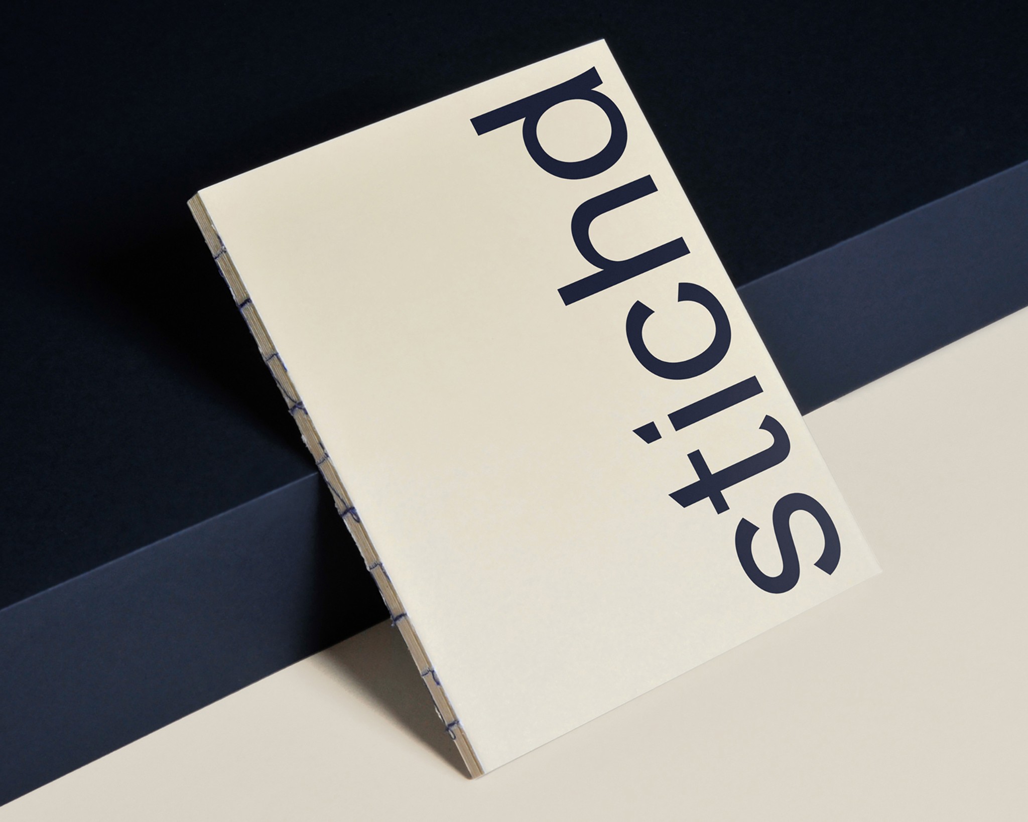
Triumph:
Modernising a heritage lingerie brand.

Liked, but not loved.
Triumph is a global lingerie and intimate apparel brand, founded in 1886. The brand once led the industry through innovation and boldness, but experienced slowing growth over time. Triumph came to us during a standstill, where they were “liked” by existing loyalists, but not loved or discovered by new audiences. Through a new strategy and identity rebrand, our objective was to inspire consumers to love Triumph for a genuine and distinct reason.


Blending the classic and dynamic.
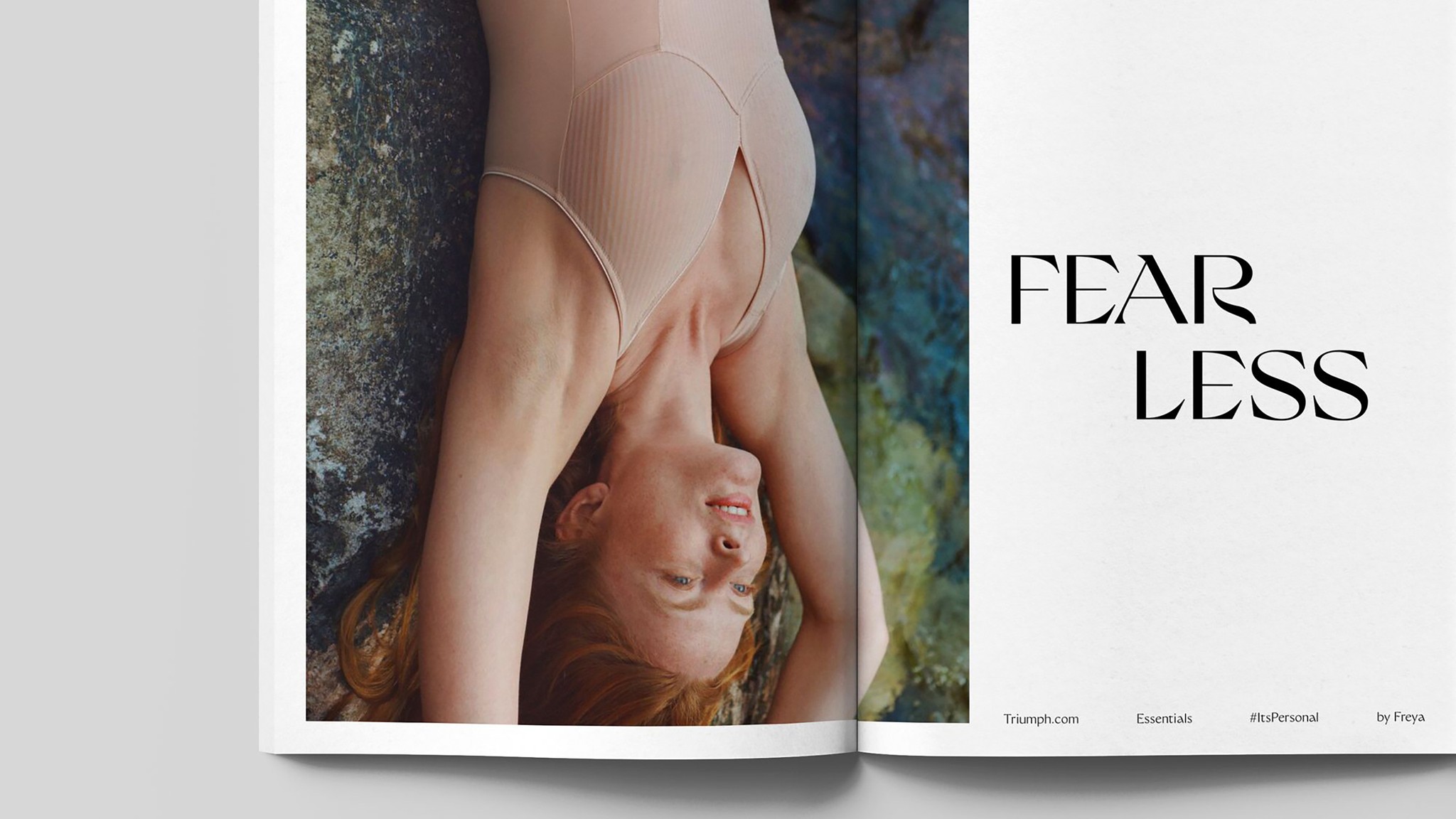
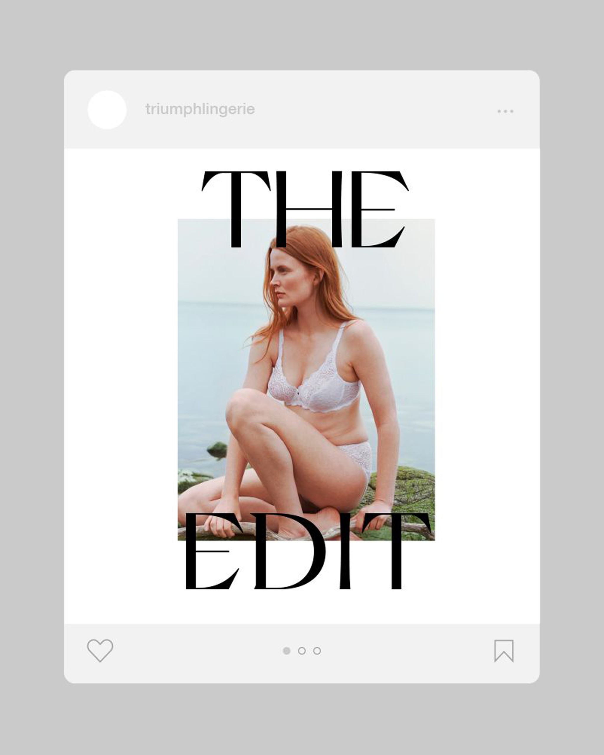
We worked with Nikolas Type to create a bespoke version of Grand Slang for Europe, called Triumph Grand, with softened edges and rounder points. AR Mochi for Japanese and Chinese became its Asian complement. Classic typography styled boldly to reflect Triumph’s dynamic future.

Celebrating the individual.
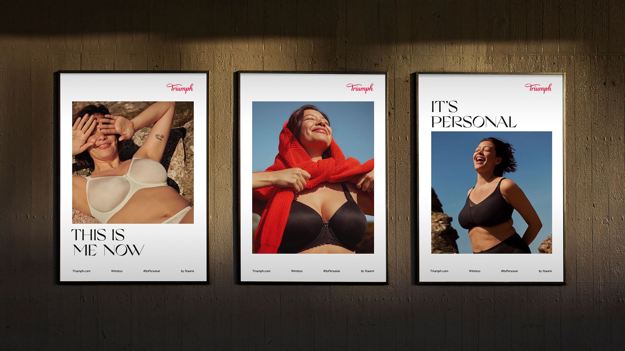
Our positioning was pinned on the core belief that women already know what they want. A better bra will not change a life. But quality products that live within thoughtful, confident communications can carve out a space for women to feel truly understood and enriched. It’s about real dedication. An unapologetically personal approach. For you, for life. Whichever form life takes.



Standing by our values.
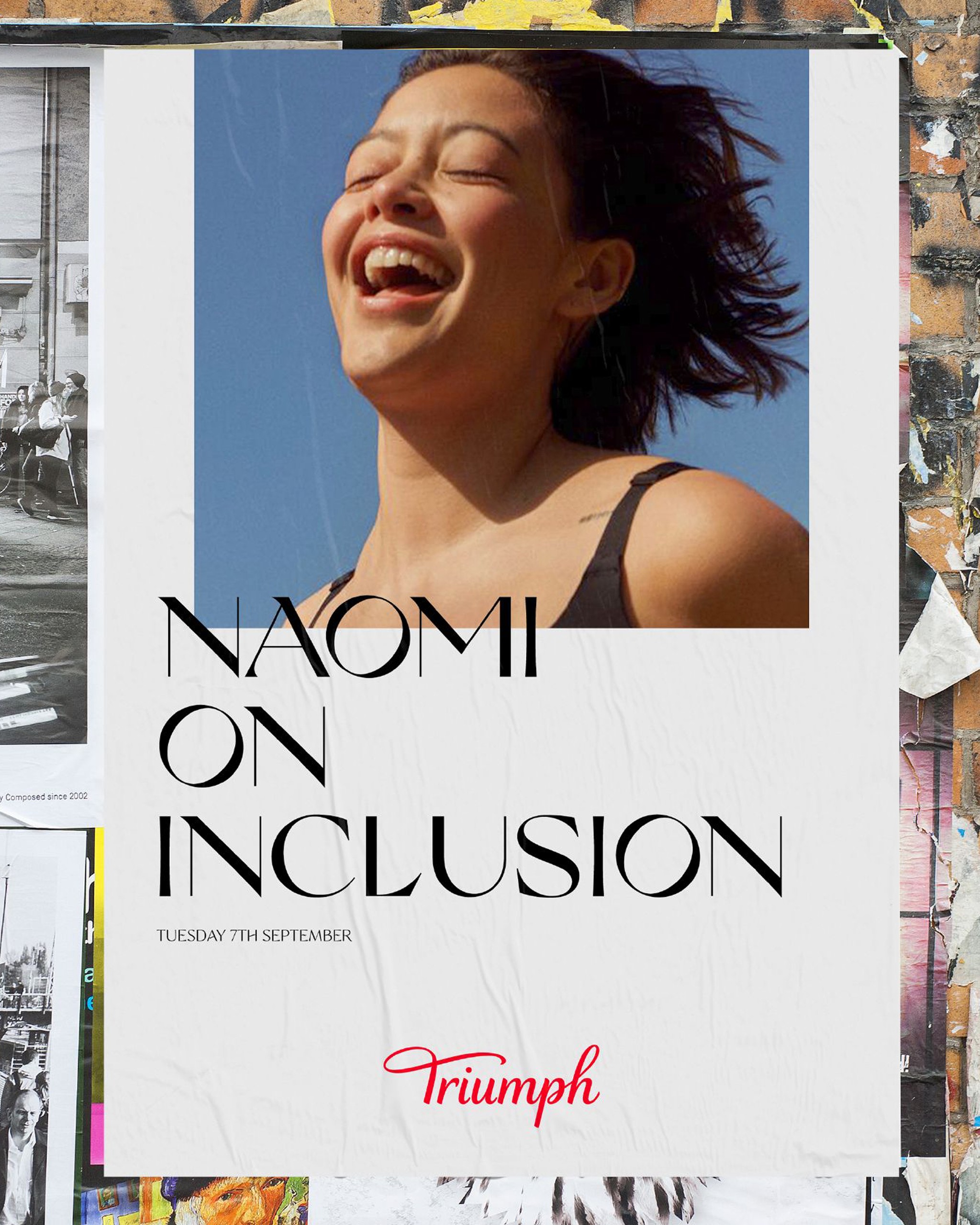
To demonstrate our beliefs, we developed a set of Brand Essences that showcase Triumph’s commitment to enhancing life for all women. Editorial art direction updated visual language into a more premium realm.

Free the crown.
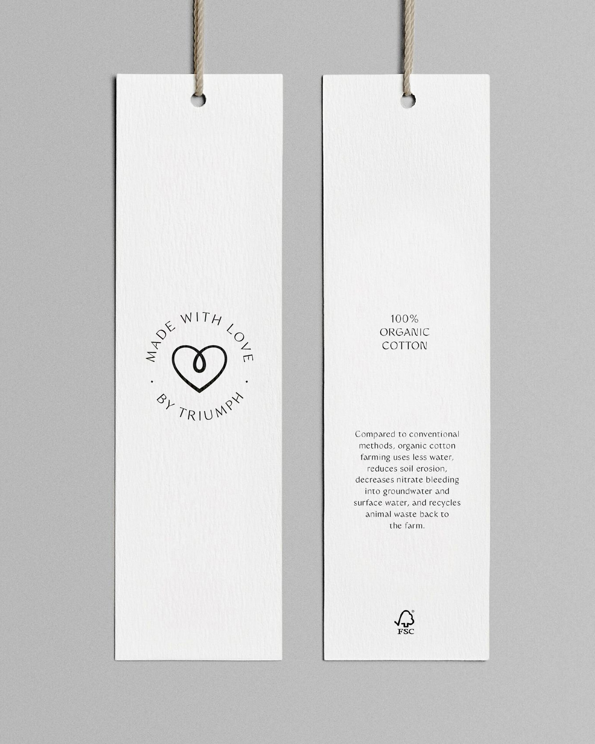
Preserving legacy logo elements in a modern way, we freed the crown from the wordmark while developing a mark of quality seal that puts our mission first.


